Before & After
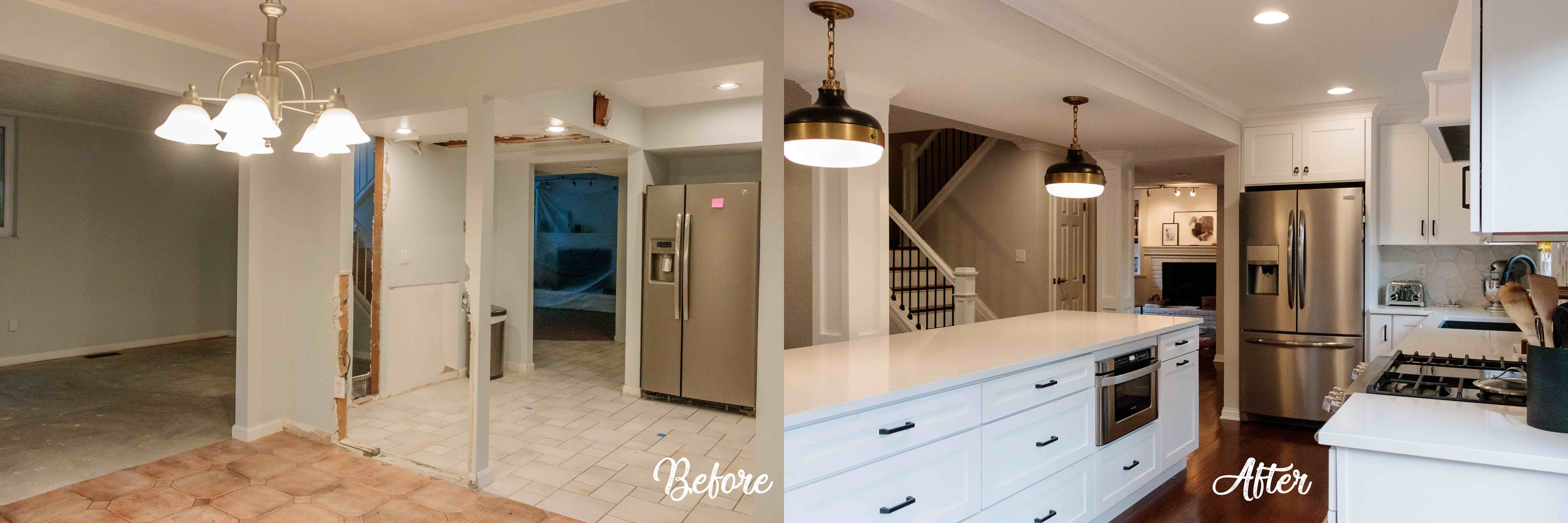
Removed several walls to open up the space.
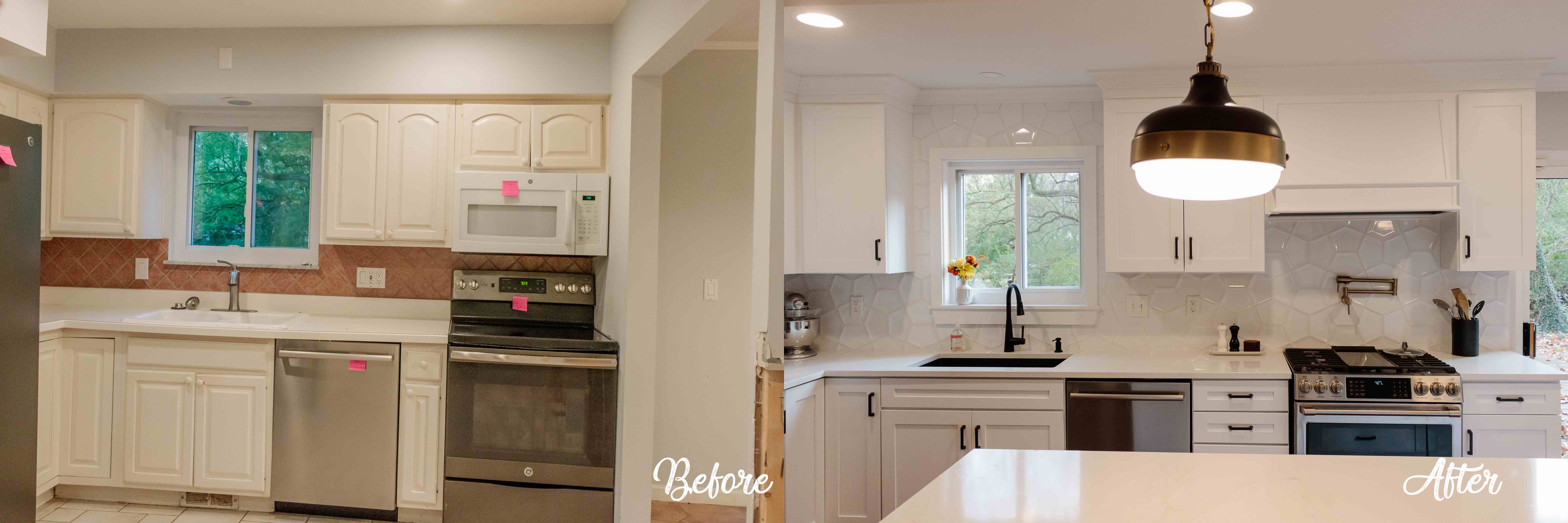
Mixed metals to add interest to a white kitchen.
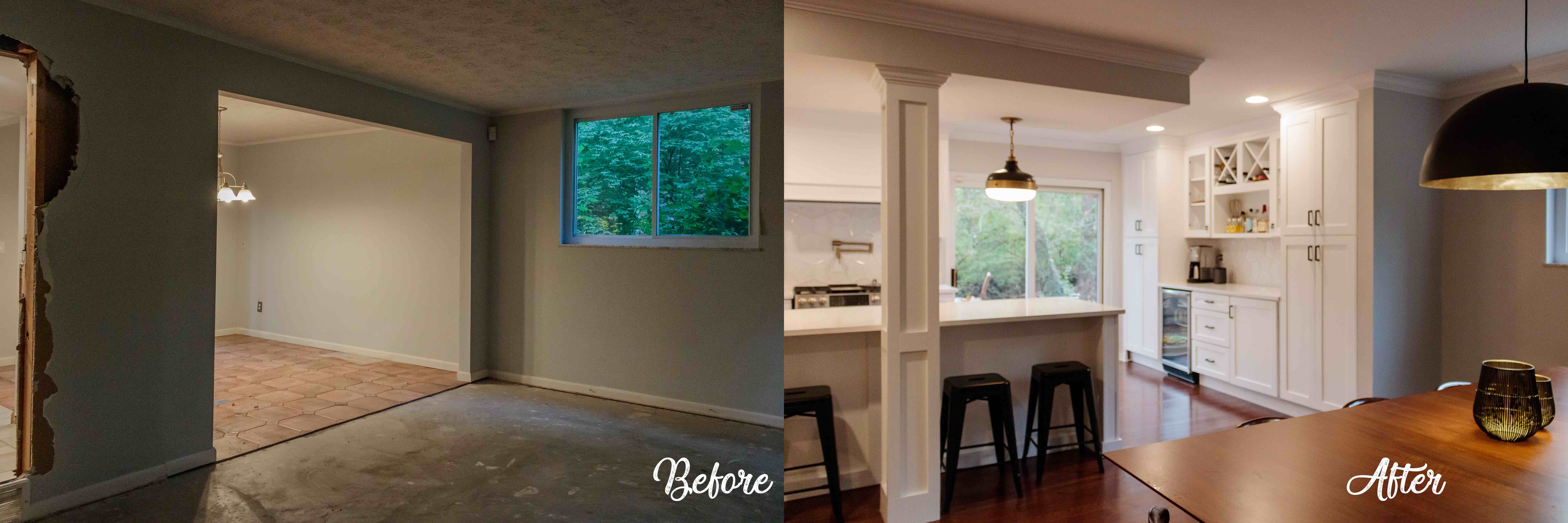
Separate but connected.
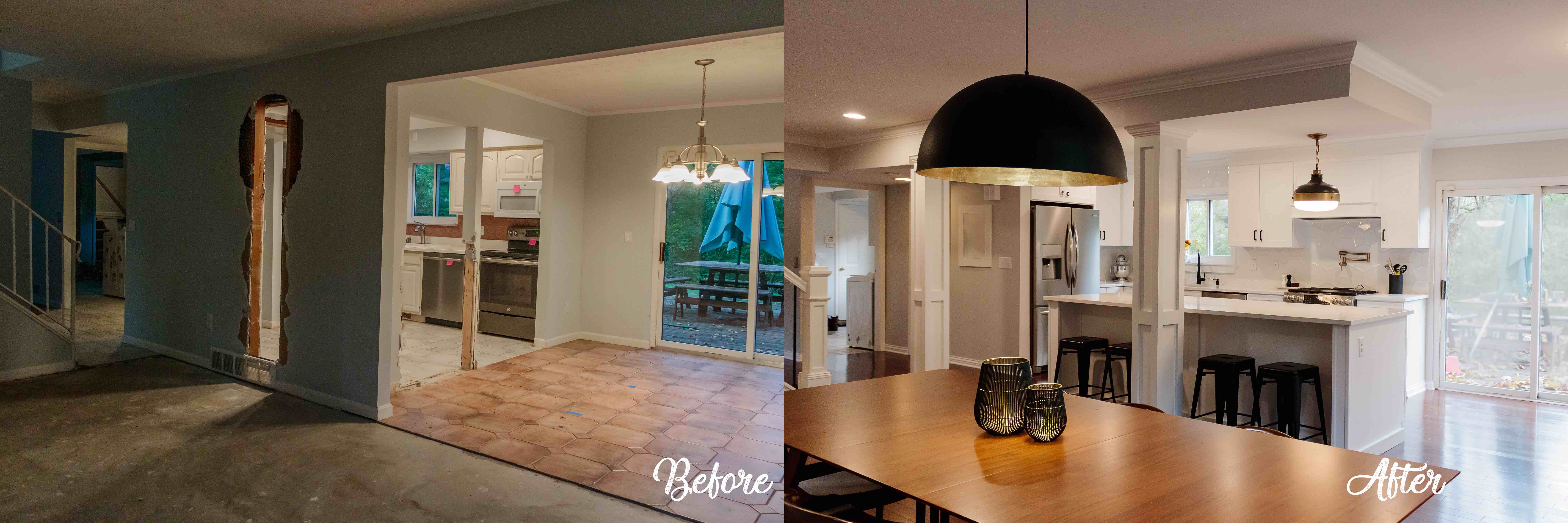
Dining looking into kitchen.
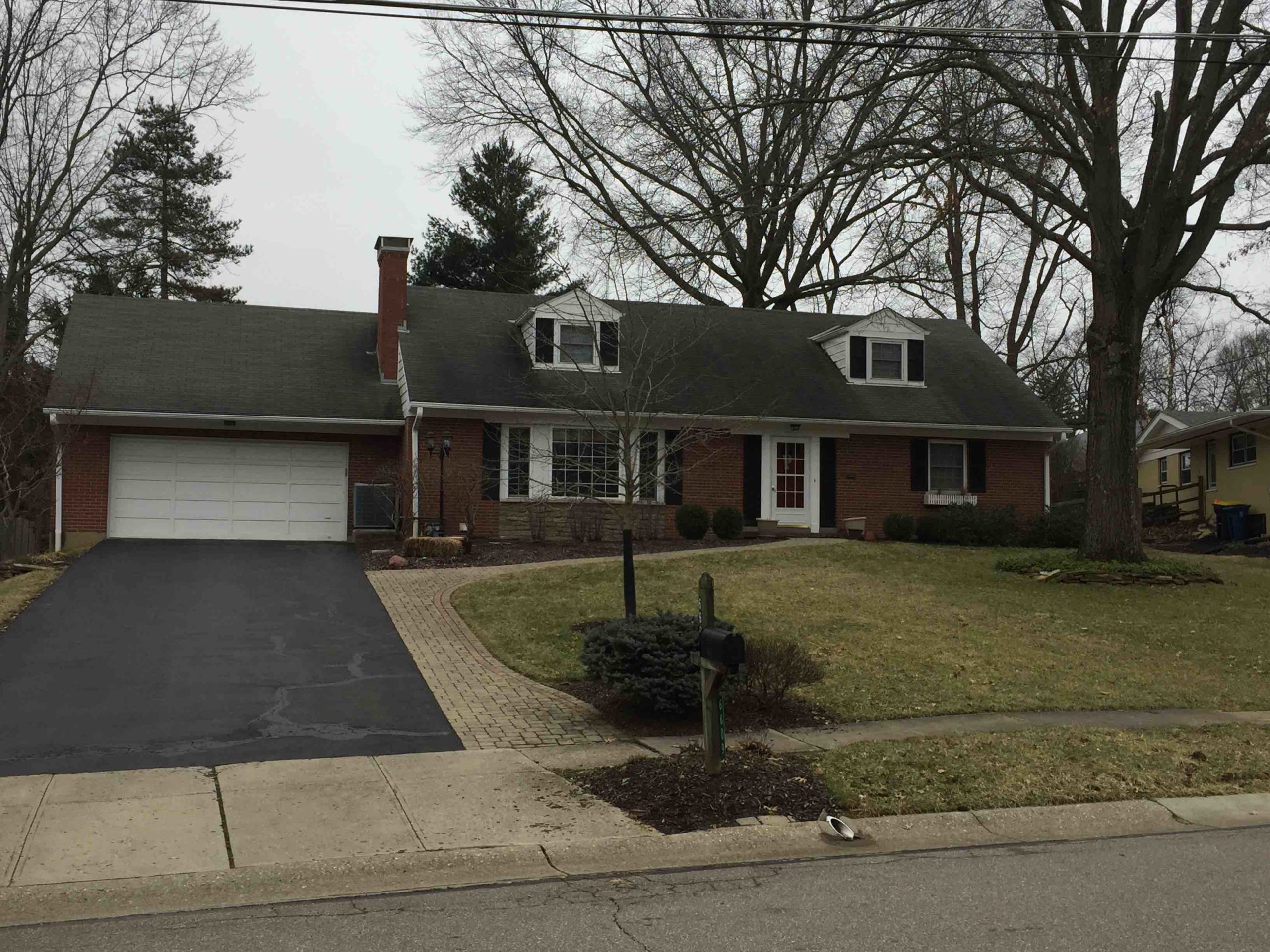
Cape Cod Exterior (Before)
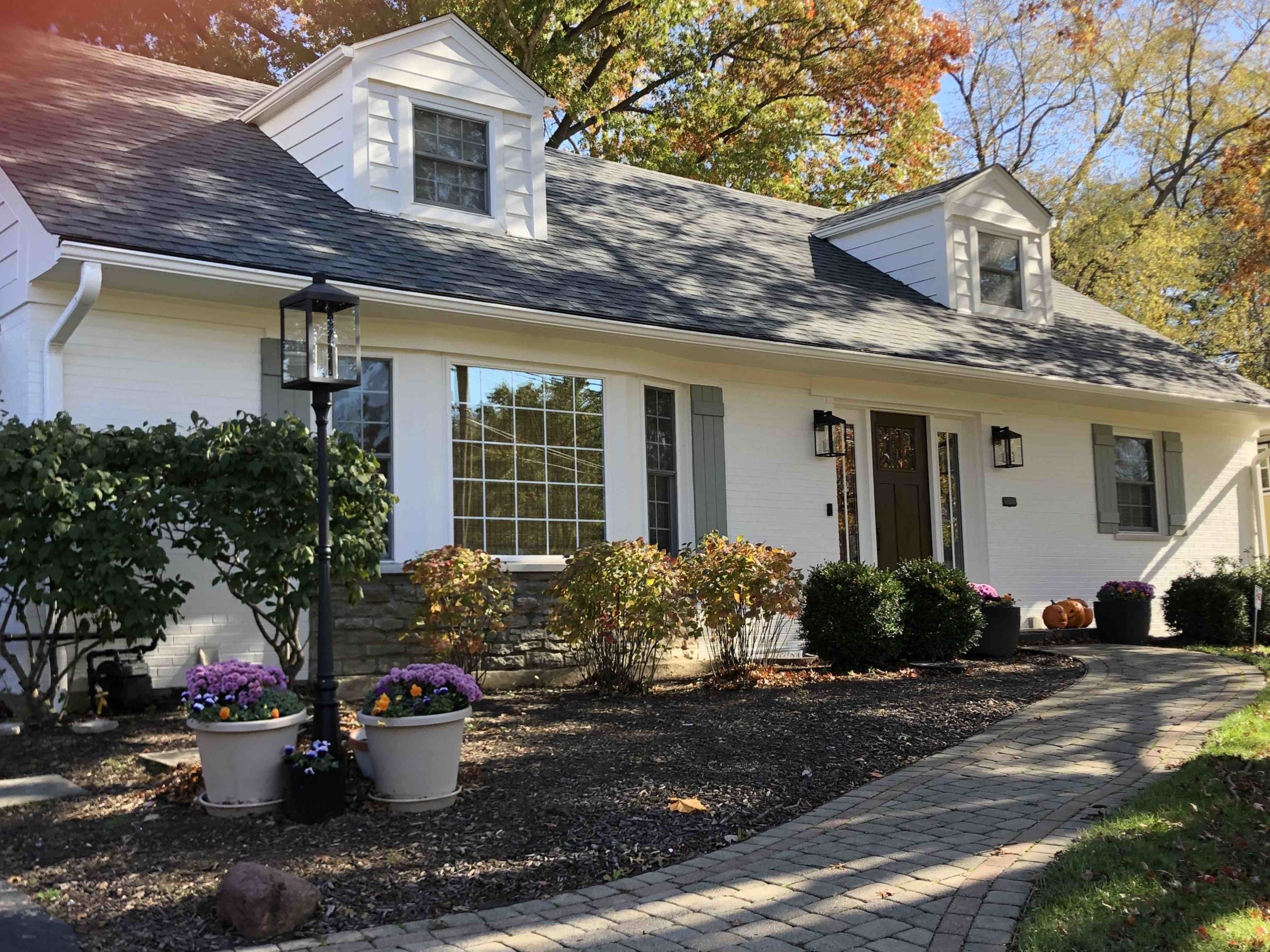
Cape Cod Exterior After: We painted a soft white, installed new garage door, new “slate” roof, new lighting, new front door with sidelights and new shutters (with a hint of green). Such a transformation – see what it looked like before in Before/After gallery.
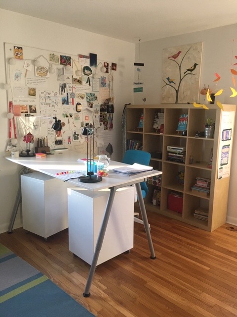
Home Office Sitting Area Before:
New York creative professional wanted a new home office that was clean & modern yet whimsical. She gave free reign but asked to keep the relatively new teal ergonomic chair and bird painting.
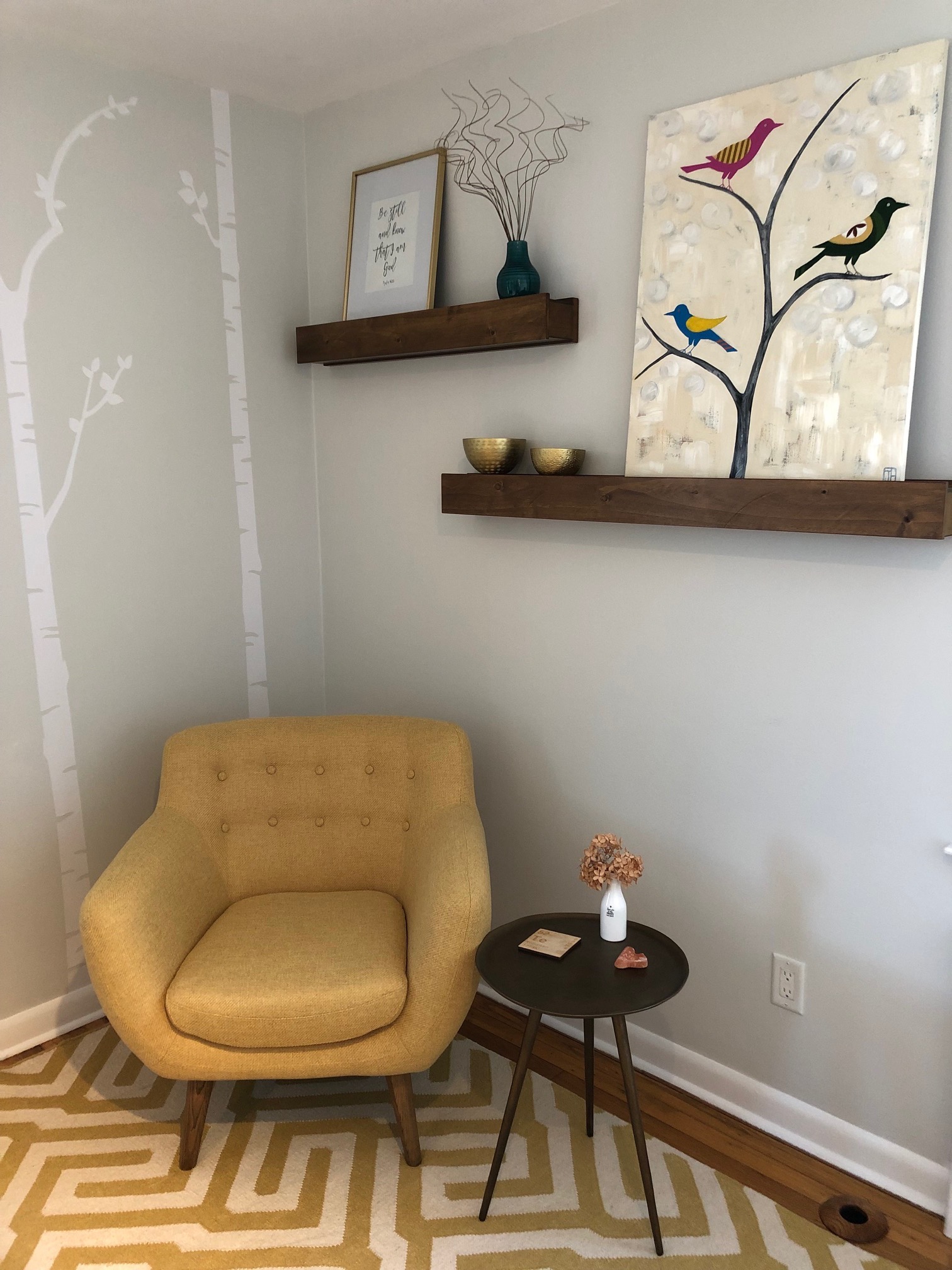
Home Office Sitting Area After: The bird painting inspired the whimsical birch tree wallpaper decals which are calming yet fun. Because client wanted white sit/stand desk we warmed up the space with wood floating shelves, brass accents and an inviting guest/sitting area with a mid-century modern yellow chair, amazing geometric area rug and brass table. We accessorized the shelves with blue and brass to give added warmth and balance to the room.
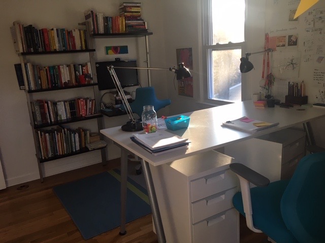
Home Office Storage Before: Client had a lot of books and supplies that needed to be readily accessible but created a cluttered look.
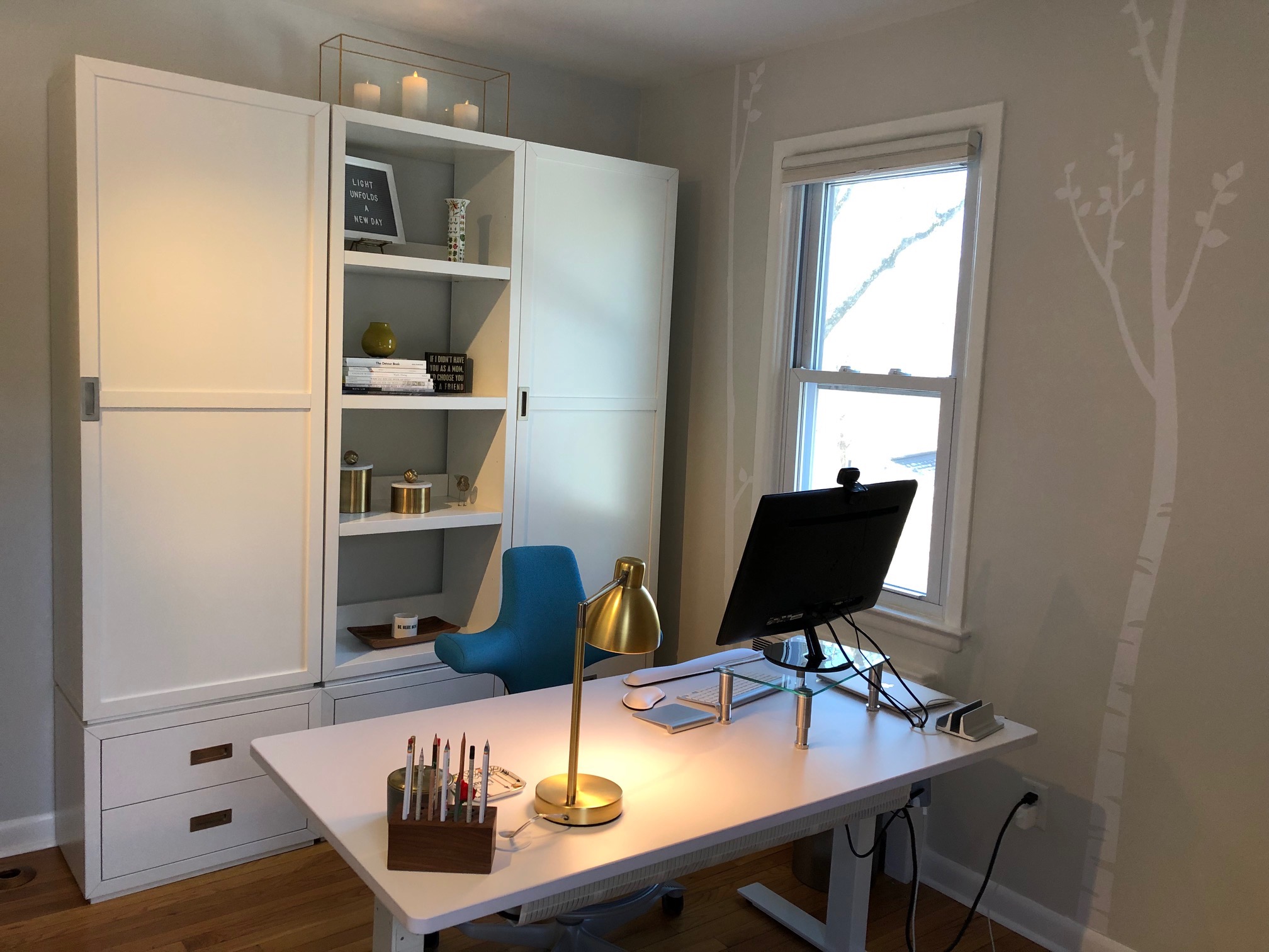
Home Office Storage After: We gave her lots of closed storage for a streamlined, organized space with room to breathe. We mixed in open storage so she could display items that are meaningful and beautiful …again adding in touches of wood, blue, yellow and brass for warmth and balance. This will serve as a perfect backdrop for videos as the displays are easily changed out.
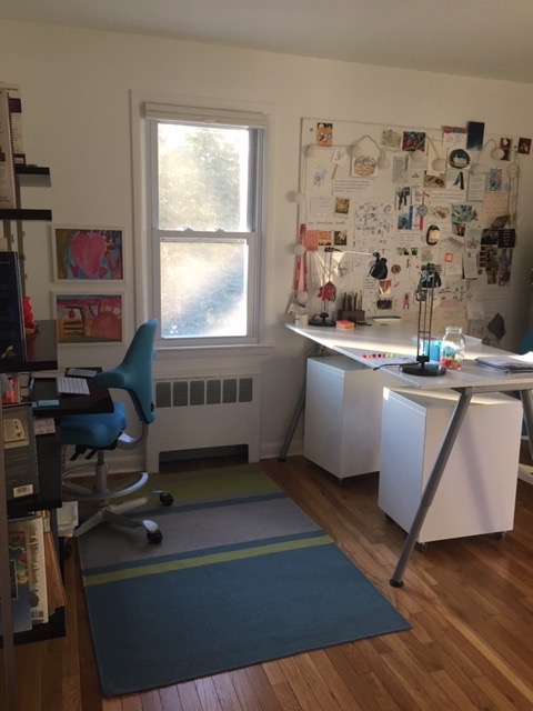
Home Office Before
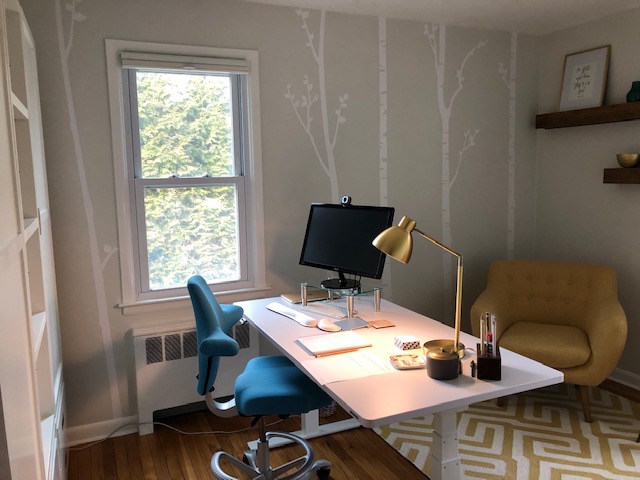
Home Office After: Just waiting on the brass statement light fixture to arrive and be hung over the desk! Client loves her new space and I do too!
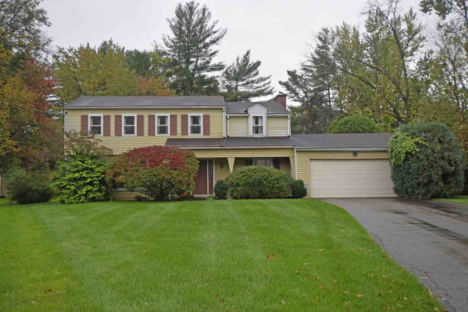
Exterior Before: House had been vacant and somewhat neglected for over six months prior to renovation, but the vision was there!
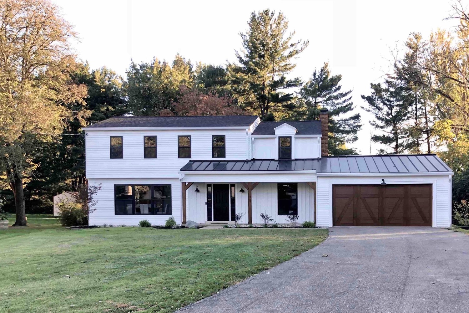
Exterior After: We completed a total transformation into a modern farmhouse with a new roof (metal over the porch and garage), paint, some board and batten siding, and new black windows. In addition we cleaned up the landscaping, added new lights, a new garage door, and cedar wrapped posts.
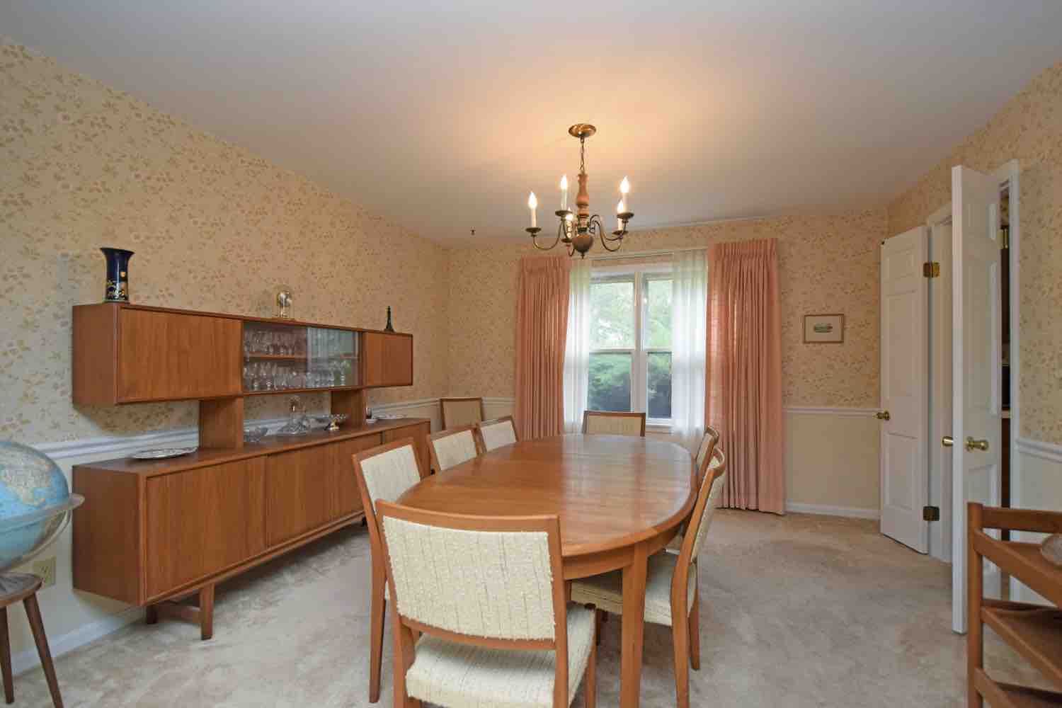
Original Dining Room: The original house had a small dining room and small kitchen separated by the wall on the right.
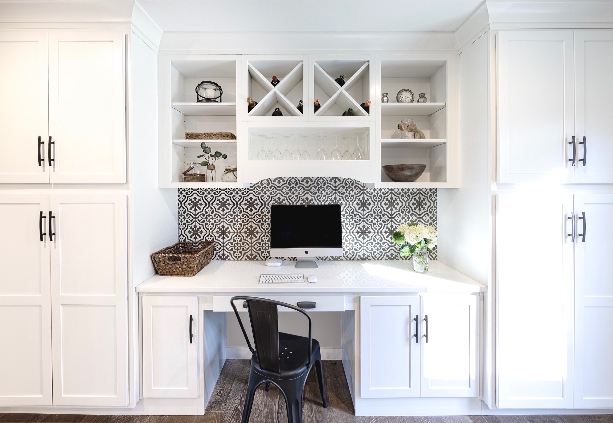
Previous Dining Room After: The wall between the dining room and kitchen was removed, creating one large kitchen. A door to the new back porch replaced the window, and a pantry, desk and wine nook was added along the side wall where dining room used to be.
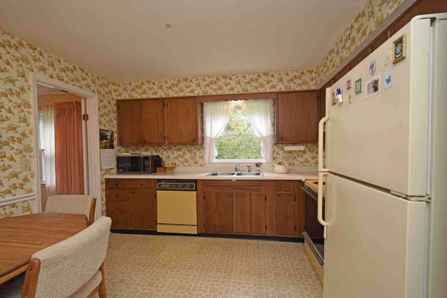
Kitchen Before: 70’s vintage, complete with an in-wall cassette deck. (If only we could bring back mix tapes!)

Kitchen After: To make kitchen bright, white shaker cabinets were installed. A large island with a butcher block countertop, and matching floating shelves adds warmth to space and provides functional seating and extra cabinetry underneath. To keep kitchen bright and modern, white quartz countertops were installed along the perimeter along with new stainless steel appliances. For a unique look that adds interest and charm – while still keeping space neutral – a soft charcoal black and cream patterned backsplash was installed running all the way to the ceiling.
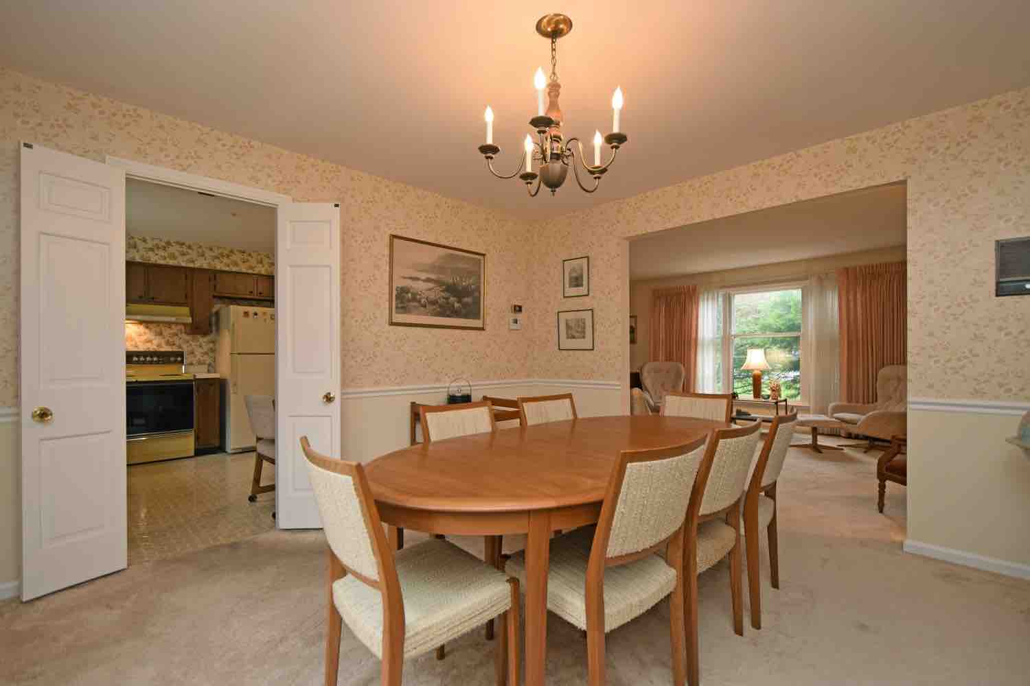
Kitchen/Dining Before: House was very compartmentalized and dark prior to renovation.
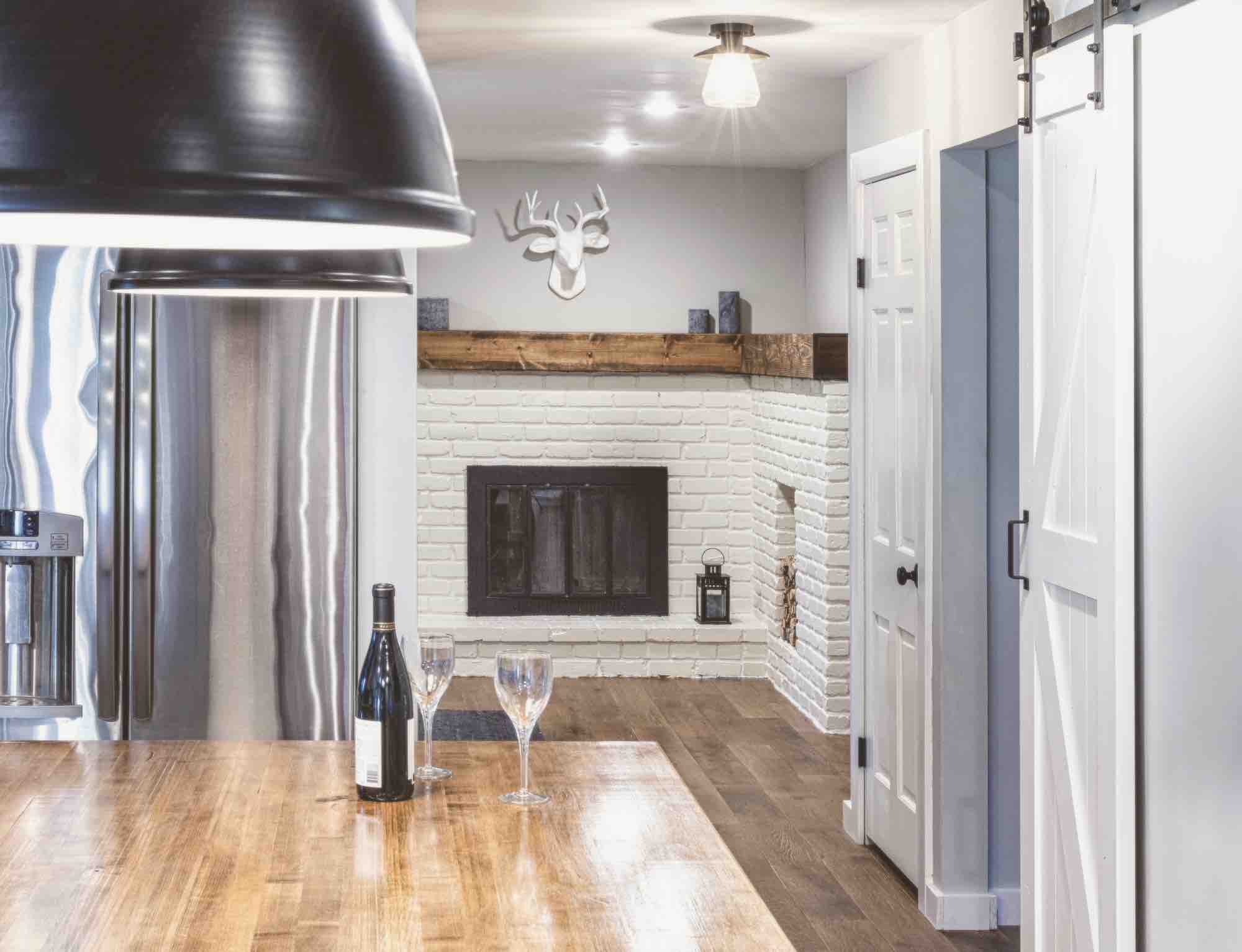
Kitchen After: Not only was the wall removed between original kitchen and dining room, but the hallway to the hearth room was widened to create a more open, light, and airy feel.
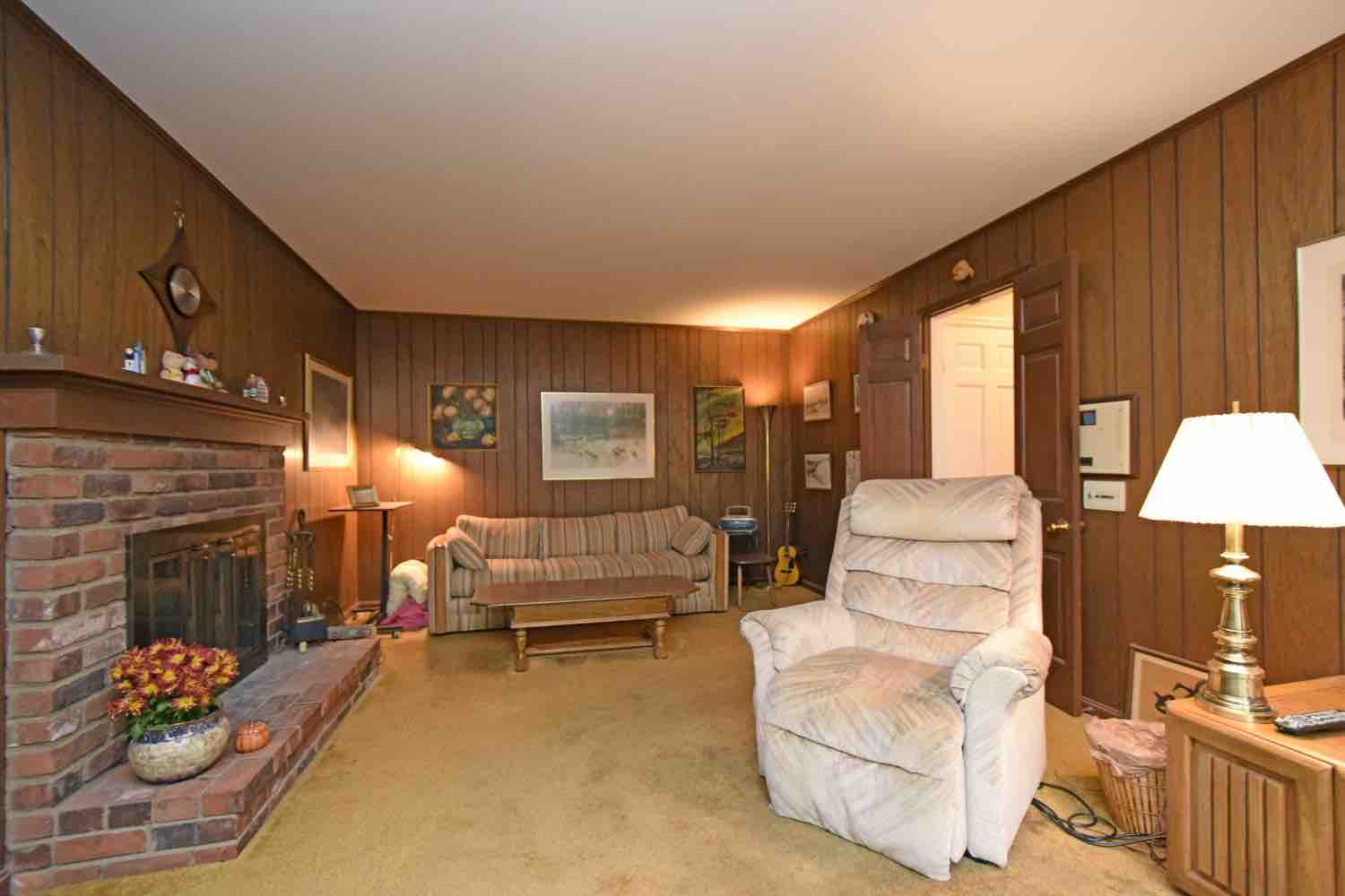
Family Room Before: We said goodbye to the wood panelling…but had to keep the original wood burning fireplace of course.
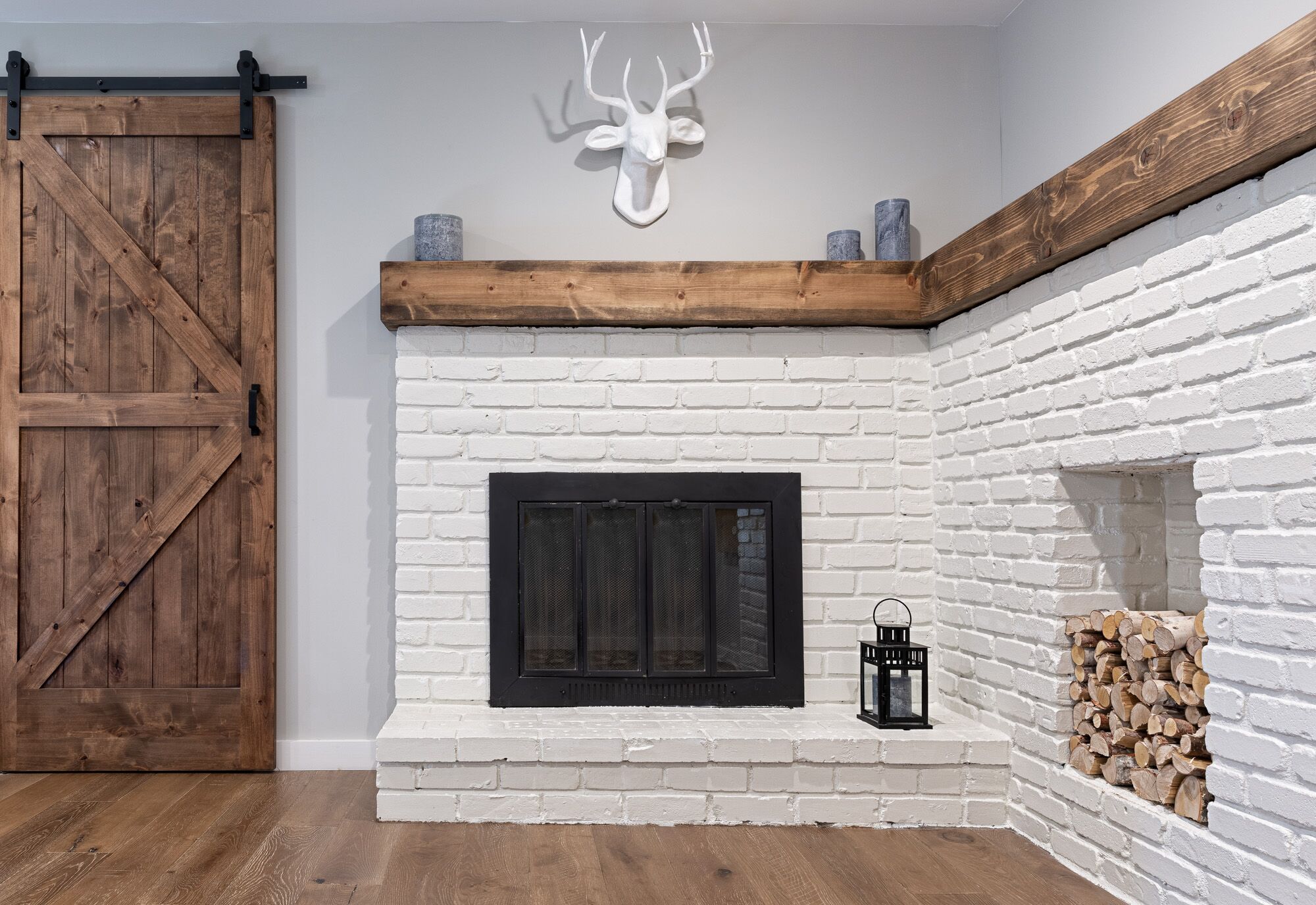
Hearth Room After: The fireplace was transformed by adding new mantels and a brick return with a cubby for firewood. The dark brick and brass fireplace front were painted, giving it a fresh, updated look. A mudroom was also added to the home – behind the sliding barn door – to provide direct access to the garage. A few chairs in the hearth room now serve as the perfect place to have morning coffee or to catch up with a friend/spouse over a glass of wine at the end of a long day.
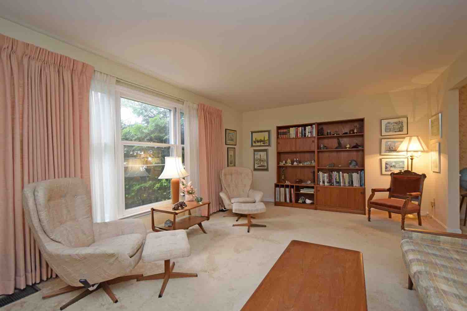
Dining Room Before: The original living room was converted to dining room for extra space to entertain family and friends.
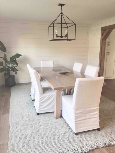
Dining Room After
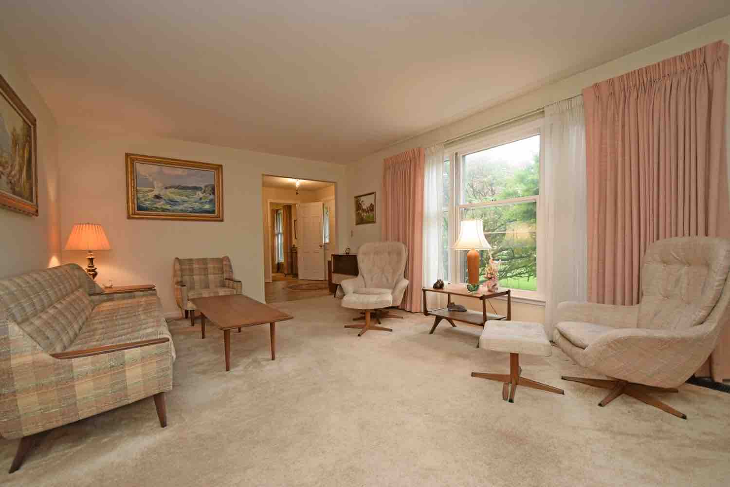
Dining Room Before: The original living room was converted to a dining room, but it was about twenty feet long, so there was too much leftover space. What to do with it?
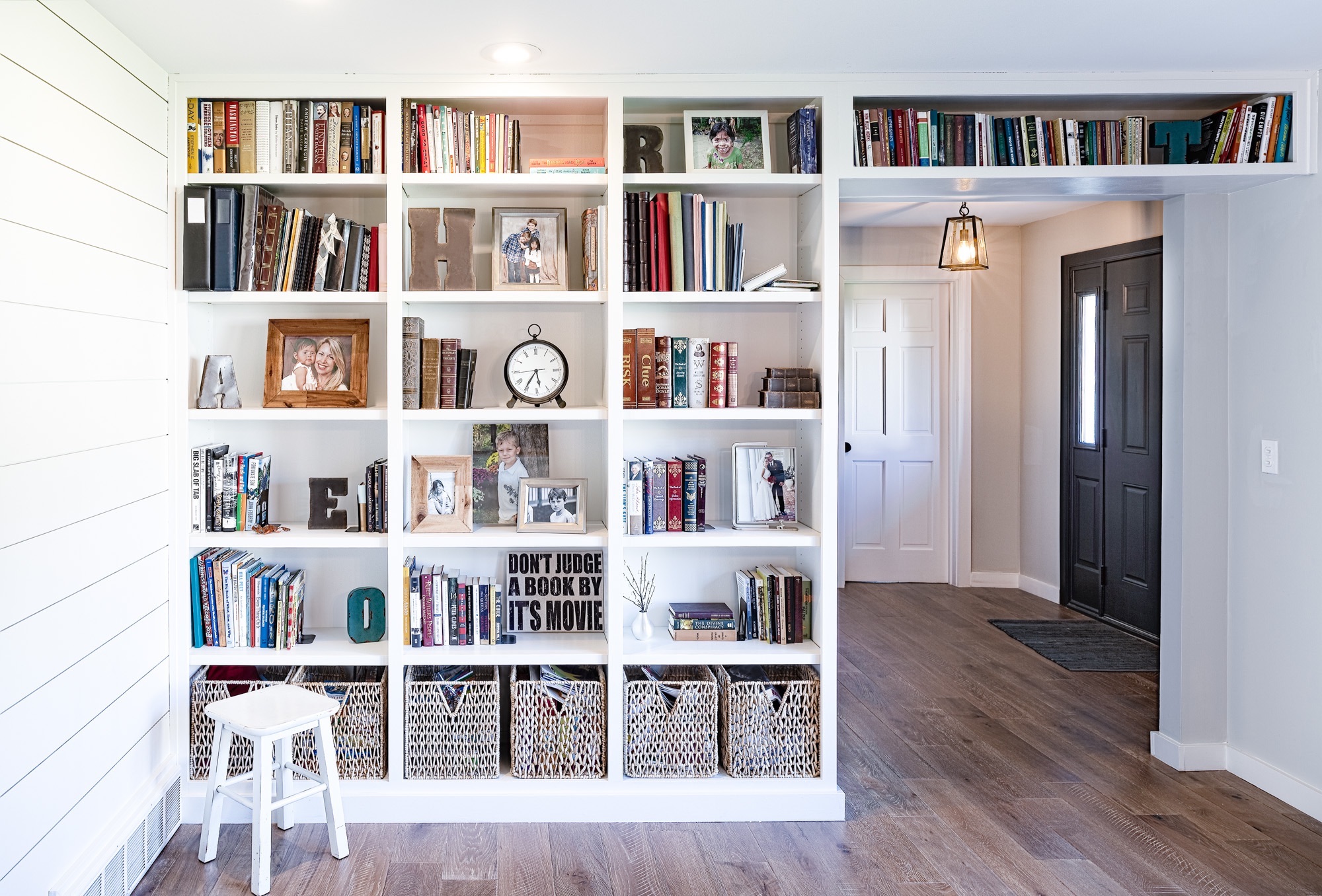
Dining Room After: We added built-ins that wrapped around the entranceway for drama. The built-ins were designed to allow for baskets at the bottom for visual interest and to keep kids’ craft materials out of sight, providing a cost-saving alternative to cabinets.
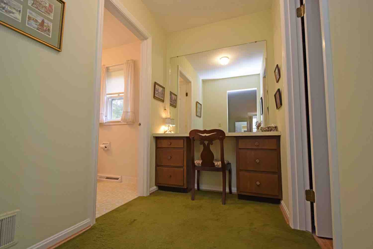
Master Bathroom Before: The small master bathroom was separated into two tiny rooms, and there was no bathtub, which didn’t fly here.
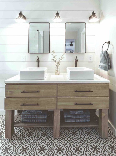
Master Bath After: We opened the bathroom by removing the wall dividing it. A soft, patterned tile echoing the kitchen backsplash ties the house together and keeps the all-white bathroom from looking sterile. For extra storage, the selected vintage style mirrors hide recessed wall cabinets.
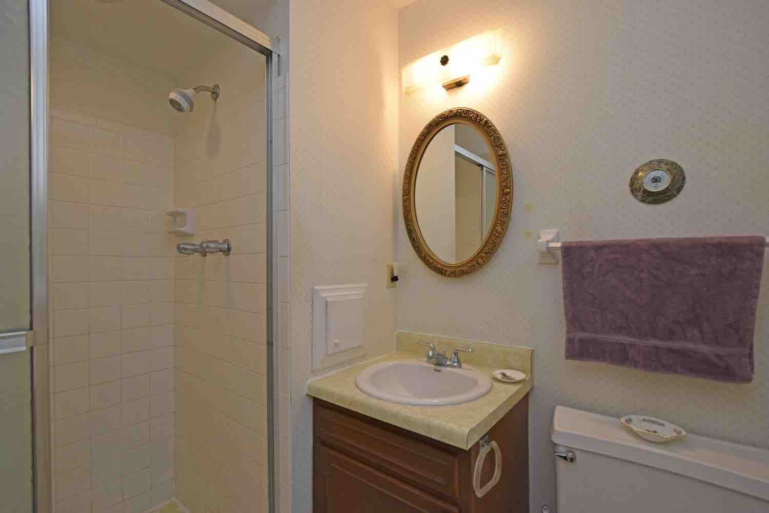
Master Bathroom Before: The small master bathroom was separated into two tiny rooms and no bathtub which didn’t fly here.
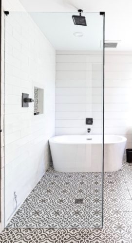
Master Bath After: We created a wet zone in the bathroom, allowing for a spacious shower (with two frameless glass panels) and a bathtub that is more a work-of-art than appliance. Allowing for the floor to carry through entire bathroom creates a more spacious feel. And, this small bathroom feels as much like a spa (farmhouse style) as much larger bathrooms I’ve done. I’m so pleased with how this turned out!
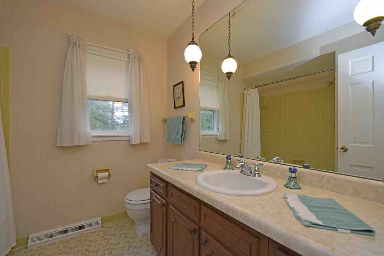
Hall Bathroom Before: Three bedrooms feed this bathroom, so one sink just won’t cut it…
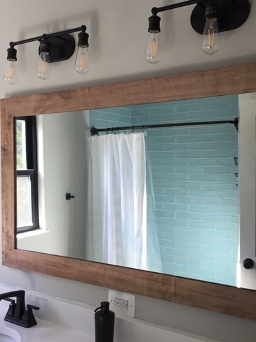
Hall Bath After: We installed a new vanity with double sinks, new tile flooring that mimics hardwood, new lighting, a quartz countertop, and new spa blue handmade tile for bathtub/shower running all the way to ceiling so that it can be seen peeking above airy shower curtain.
